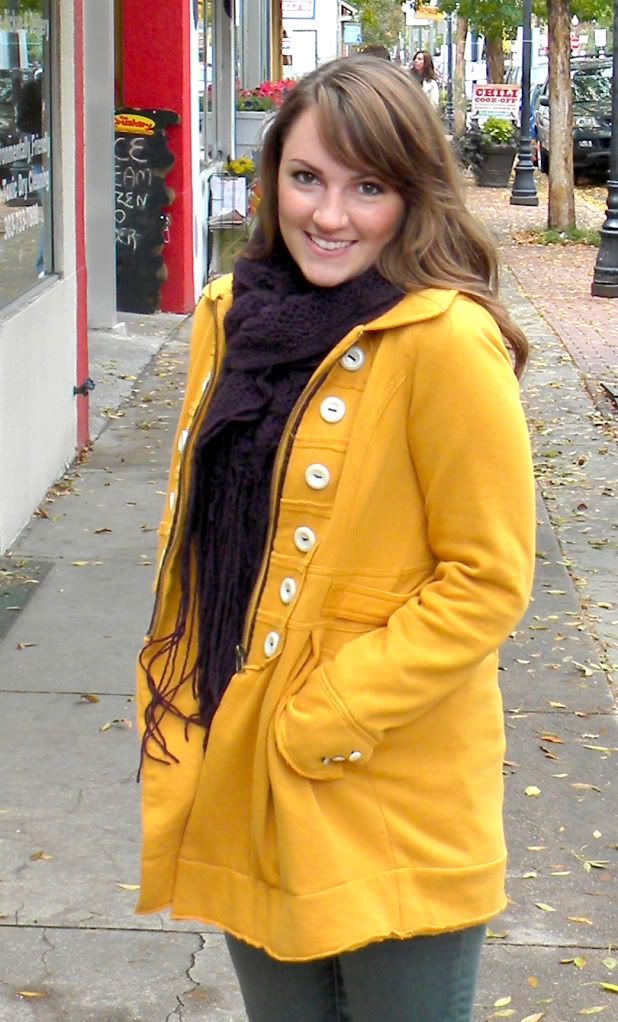
This is a year of changes for me. Some of them small some of them big, either way the key is going to be to learn how to simplify my life in preparation for this change. One of those things I hope to accomplish very soon is to give my blog a make-over. It has been long overdue. Today's guest post is by one of my designer friends who addresses both issues. I hope you will take a look around her blog, she has some great suggestions.
*****
Hello Everyone! I'm so excited to be featured by Sarah today! Isn't she great?
*****
Hello Everyone! I'm so excited to be featured by Sarah today! Isn't she great?
Quick introduction: I'm Caley (long "a" sound).
Sarah and I attended school together a few years back and have both, obviously, fell in love with blogging as well! I share my design work at Design by Caley as well as write for howdoesshe.com.
Sarah asked if I would talk a little bit about simplicity today.
Not only is it important in life, but also in the design and blogging world.
One thing I love about simplicity is that it lets the details speak for themselves. It allows the eye to settle on the focal points while settling the mind on what is most important for the moment.
The same thing is important in blog design. Blogs have backdrops, focal points, explanations, and drama. But WE must decide what they are. I recently realized this and gave my blog a makeover.
Tips I've Learned over my Blog Designing Years:
Simple is Better. While it is fun to have cute backgrounds, buttons, headers, and so forth, don't get carried away. A busy looking blog can be distracting for readers. Decide what is most important and make that the focal point (it should usually be your posts.) Do this by simplifying all the other aspects of your blog.
Don't be Afraid of Negative Space. This allows the more important aspects to stand out. Think of a museum. The backdrop is completely white allowing the art to be the focal point. It is the same with blogs. Use that space to frame the important things and lead the eye to what you want readers to go to first!
Font Overload. There are some pretty awesome fonts these days. I could not choose a favorite if you made me. ;) BUT that's not a reason to use them all. The general rule for fonts is to not use more than two, three at the most. Decide on 2 main fonts. Select the easiest to read (i.e. arial, georgia, helvetica, century gothic) for the body of your blog. Then use the other as the date, gadget, or post titles. This allows for personality, but also lets your readers actually read the text. There's nothing worse than going to a blog and giving up after the first sentence because you can't read it.
Pictures Speak How Many Words? Photography is a beautiful thing. It captures moments, tells stories, evokes emotion, brings back memories, and much more. You don't have to have a fancy camera to take a good photo. You also don't have to have a perfect photo to blog. But in today's busy world, most readers are skimming their favorite blogs, not necessarily reading them. Photos allow readers to stay updated without spending a lot of time reading. That's why it's a good idea to include a few photos in your posts.
Once you have those beautiful photos, make them BIG! In the template designer under "adjust widths" it allows you to widen your blog enough to make those photos big enough to see what's going on! When writing your posts, click on the photos you've uploaded and choose "x-large". I promise it will be worth it. ;)
Tabs/Pages. This is one of my favorite aspects of the new blogger. They can help clean up your sidebars by taking those many photos, stories, and buttons and organizing them into categories under your tabs. It's also much easier for readers to navigate through. They can be placed across the top, under your header; or along the side like the ones on my blog.
See all the blogs I've designed HERE!
If you haven't figured out the new blogger interface quite yet, you're in luck! I've recently made a quick, basic, tutorial. See it HERE!
I hope these tips help you as you simplify your blogs! If you have any questions feel free to email me at caleypark @ gmail.com!
Thanks!
If you haven't figured out the new blogger interface quite yet, you're in luck! I've recently made a quick, basic, tutorial. See it HERE!
I hope these tips help you as you simplify your blogs! If you have any questions feel free to email me at caleypark @ gmail.com!
Thanks!


Thanks for featuring me Sarah! :)
ReplyDeleteGreat post Sarah, lots of info here for me TFS
ReplyDeleteThanks for the informative post, Sarah and Caley. Keeping things simple is common sense but something we all tend to forget. :)
ReplyDeleteGreat blog! It echo's one of my favorite quotes from artist Hans Hoffman:“The ability to simplify means to eliminate the unnecessary so the the necessary may speak.
ReplyDeleteGreat blog, thanks for the information Sarah.
ReplyDelete